Last year I shared my technique for drawing hillshade with graphite (pencil). Since then, I have explored a few different methods for drawing color hillshade. I will be sharing one of those methods in this post. This method uses those graphite drawings as the base, or the starting point. So to get started, make sure you check out that process here.
Before You Begin
Everyone who wants to do this method should certainly do it! Please take note that there are some steps (especially 2 & 3) that mention the use of GIS software, including terms like digital elevation models (DEMS), vector data, contour lines, and it helps if readers are familiar with those terms and how to work within a mapping software. However, as you will read in step 2, there are some slick workarounds that I would encourage anyone to try – mainly this: If you find the area you want to draw on google maps, and then switch to “Terrain” mode, steps 2 & 3 become available. This will make more sense as you read those steps.
Materials needed
For the graphite steps (the greyscale hillshade that you draw before adding color), you will need artist quality pencils, erasers, and blending stumps. Materials needed for the color hillshade steps are:
- Soft wax-based colored pencils – There are two types of colored pencils that artists use: wax-based and oil-based. It is definitely possible to capture hillshade with oil-based colored pencils, but the method I’m describing below leverages the very soft melty qualities of wax-based colored pencils. My personal choice is the Prismacolor Premier pencils. IMPORTANT! If you don’t have all the hues you are looking for at your local art store, you can purchase them online individually. I found all of my paler colored pencils on Blick.com for about $1.30/each.
- Thick high quality paper – You can test your colors on any paper. In fact, you may not want to do your initial color testing on your most expensive paper. Your final version should be pretty high quality paper. The reason for this is that soft wax-based colored pencils are designed to blend together. You can add layer upon layer of colors to blend into the perfect shade. If your paper is intended for sketching, it might not handle all this color reworking. For the map and warmup sketch that I am showing in this post, I used Bristol XL recycled 96lb paper.
- 3. GIS Software – Additionally, if you are drawing for precision, beginning your hand-drawn map in a GIS (for tracing ridgelines and other data like roads, rivers, etc.) is recommended. You can also trace these from a printed image instead. This tracing process is described in more detail in this hand-drawn hillshade tutorial. Note that you will only trace the ridgelines, and maybe a few stark river valleys. These ridges will serve as the framework around which you will freehand draw your hillshade.
Why GIS for hand-drawing a map?
You do not have to use GIS at all. However, beginning your hillshade by registering the four corners of your drawing with the map extent on your screen or light box, and then tracing the ridges, you’ll be able to return to your GIS map to precisely trace other data like rivers and roads. This is a matter of preference. I added vector roads, rivers, lakes, and more to my hand-drawn map that I share at the end of this tutorial. For this reason, precision was pretty important, and I began by tracing my map’s ridgelines from a digital elevation model (DEM) in ArcMap.
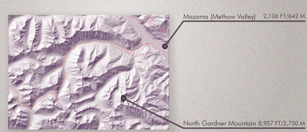
About the mapped area
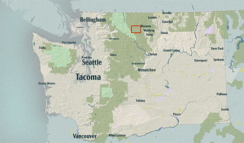
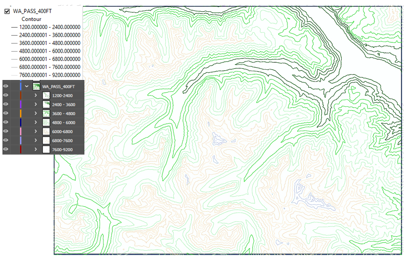
I will be drawing the area in the red square below. That square is nestled in the North Cascades mountain range, with wetter western slopes on the western side, and the dry Methow Valley in the northeast. Therefore, while this area is only 17 miles across, like many mountainous regions, it covers a wide range of ecosystems and landscapes.
In addition to the ecological diversity in this area, it is very steep. This is what makes it so fun to draw! The highest point in this area is North Gardner Mountain at 8,957 feet and the lowest is the Methow Valley at ~2,000 feet.
1. Choose a COLOR Palette
You can just rely on colors that you think would look good on your map, or you could do a little research about the area you are mapping. I’m all about alternative colors, and am not particularly drawn to the aesthetic of the hypsometric tints default colors in many mapping software packages (more on hypsometric tints below. If you have visited the area you are coloring, or have learned a bit about it, it will help inform your color choices even if they are nothing close to reality. For example, I’ve shared this Instagram post below of fantasy map I made & wrote about here. It’s a place I invented in my imagination. I needed to “know” even this imaginary place in order to map it correctly. In the story that I have created for this place, Kystfjell is a corner of the world that is currently enjoying a long peaceful period. I wanted to choose warm soothing hues, even for the sea, so that it people would feel pretty calm when they read it. You can do this with your color scheme for your color hillshade too! The point is putting some deliberate thoughtfulness into your color scheme can be really helpful for your map.
1. a. Hypsometric tints
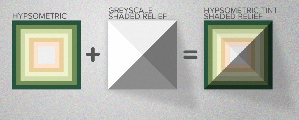
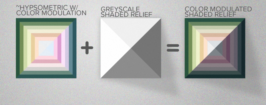
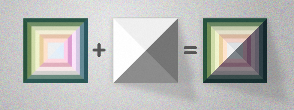
The method in this post uses hypsometric tinting, which is a cartographic technique for terrain maps where colors are applied to different elevation ranges. In the image below, the square landscape on the left has green at the lowest elevation range around the edges, and at the center the highest elevation range is white to mimic snow and ice. Just as mappers use this technique in their mapping software, this hand-drawn method relies on a hypsometric color scheme as well. The greyscale shaded relief that you will have drawn already in this tutorial will combine with your colored pencil pigments. The square on the right in the image below captures this idea.
Color-modulated relief shading
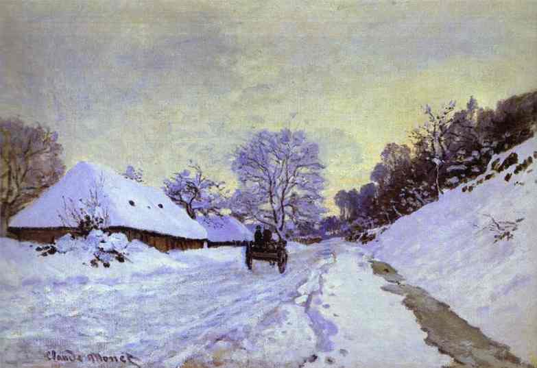
Berhard Jenny and Lorenz Hurni are two leading cartography researchers. Their article Swiss-Style Colour Relief Shading Modulated by Elevation and Exposure to Illumination (2006) describes two types of color relief shading. First, there is the aforementioned hypsometric tinting, which assigns colors to elevation ranges, and the second method is called color-modulated. This second method adds color, or modifies color, depending on the amount of illumination of a slope. For all you practicing artists who work with color, you all are familiar with the idea of shading with color. Claude Monet’s snowscape painting The Magpie is a beautiful example of this. Snow is white, but to capture warm hues of the low-angle sun, Monet uses pale golden hues where there is more illumination. To capture the shadows, he has chosen to use a pale lavender hue that sits roughly opposite from the yellow on the color wheel. In doing so, it looks like the natural color of a shadow for this landscape. In his painting The Cart, Monet uses a deeper purple, and it gives the illusion of a later time of day. He even uses lighter lavender on some of the more illuminated areas instead of warmer hues; this also helps us know that these areas are still not super illuminated. With color-modulated hypsometric tints, we are hoping to accomplish similar effects with color.
#/media/File:Claude_Monet_-_The_Magpie_-_Google_Art_Project.jpg)
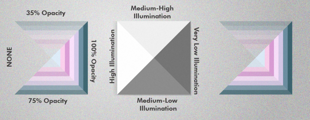
In the image above, I have chosen to show just the color-modulated hues for just the shadier slopes. In this schematic, the slope on the left (shall we say west?) has the most illumination, so it has no modulated hues. The east slope has the least illumination. Sunlight has a harder time reaching these areas, so naturally it is cooler. So it has the most intense cool-color modulation. And the north and south slopes have varying degrees of illumination and corresponding amounts of modulation. By adding these modulations to the hypsometric tints in Illustrator with an Overlay transparency, it gives a nice color-modulated hypsometric shaded relief.
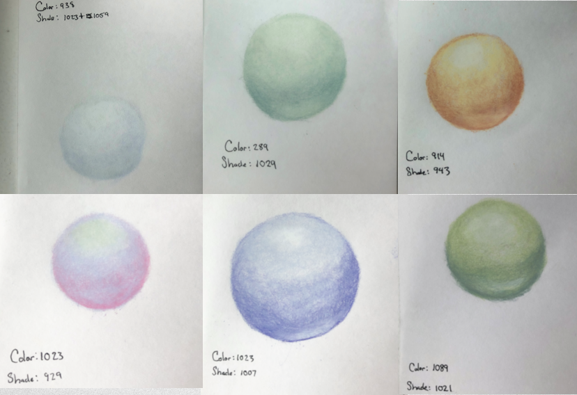
1. b. Testing out your colors
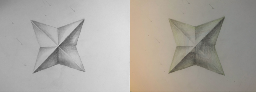
You will want to test out your colored pencils, to see how they shade and illuminate together. You can also use this as an opportunity to see how they blend together. Tip! Shading with wax-based colored pencils may be a bit counter-intuitive: You want to put the darker and bolder colors on first, and then highlight last with the paler colors. For example, the ball on the lower right is a pinkish-iridescent color. I put that pink color down first with a medium pressure, and then a light blue (slightly periwinkle) color to highlight it with a heavier pressure. This heavy pressure is great for mixing up the waxy pigments of both colors. Then I added the white color where this ball would be shiniest. I used a heavy pressure for that as well.
Tip! Shading with wax-based colored pencils may be a bit counter-intuitive: You want to put the darker colors on first, and then highlight last.
1.c. FWIW; my color scheme for this particular map
I’m sharing this color scheme as a bit of FYI, but certainly not as a rule to follow. I subscribe to the idea that we should bend cartography rules sometimes (a lot of times), but I also respect that they exist and that cartographers oftentimes appreciate reproducible steps. A long way to say: Use these colors if you want to! But you certainly do not have to to get a good hillshade. A few notes about the color scheme below:
- These are just my base colors that I used prior to the color modulation. They are the “hypsometric tints” essentially.
- The image below shows these colors without a graphite hillshade beneath it. In other words, these look brighter than they will on a lot of my map.
- A LOT of my (WIP) final map shown at the end of this post was color modulations and finer details. There is a handful of colors not present in the image below, but that I will reference in step 6 (the color modulation step).
- Apple Green & Pale Sage. I’m calling out these two colors in the image because for the videos, those are the two colors that you will see me applying in most cases. By calling them out here, I can reference them later on.
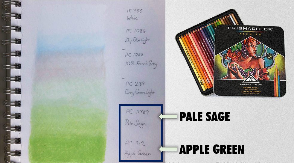
My chosen color scheme for the map and warm-up sketch shown in the videos below. The order of these colors parallels the order of the elevation ranges upon which they are applied, lowest is Apple Green, and the highest elevation range is White.
2. Add Contour Lines (in GIS if possible)
This method I’m describing in this tutorial is based upon hypsometric tinting, and by definition (see above) the tints correspond to elevation ranges in the mapped area. For this next step, I like to add contour lines to my map in the GIS software, and then use them as a visual reference for where the colors should go. I was using ArcMap 10.6, and this video by Logan Hall is a wonderful tutorial for how to add contour lines if you’re curious. However, if you are not using GIS there are a few ways you could approach getting your colors to correspond with the elevation ranges in your map. The first way would be to simply use your best judgement for where your color scheme would/should be applied – aim for the lowest areas to have that lowest-elevation color from your scheme. Note: I have done this, and it is challenging. Another way might be to find your mapped area in google maps and turn on the “Terrain” view. This will show you some contour lines of your mapped area.
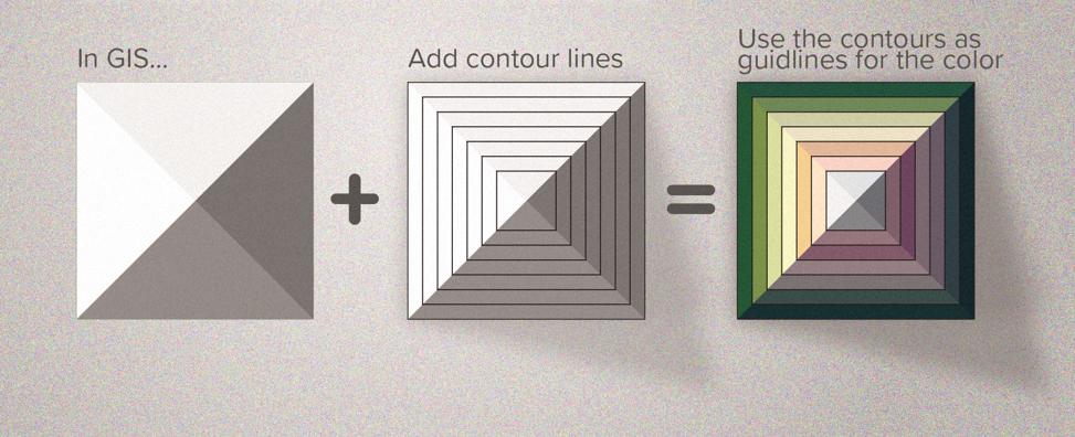
For my map, I added contour lines at 400-foot intervals for this step (I used 500-foot contours as the cartographic display on the final map). I have my reasons for this, which ultimately are two-fold 1) It is easier to finely tune the range sizes in the next step when the intervals are smaller. 2) A 500-foot elevation range on the final map is just easier to read. This will make sense as you read step 3.
Step 3: Group the Contour Lines into Ranges

You are excited to draw! We are on step three, and drawing hasn’t started. Step 1 is picking out some great colors, and steps 2 & 3 assure that your well-chosen color scheme is applied to actual real-life corresponding elevations. Doing so makes for an impressively dramatic outcome, so I find it worth the time. In step three, you’ll want to apply your knowledge of the mapped area to your contour lines by grouping them appropriately. I am very familiar with the area I am drawing for this map, and I know the various ecosystems that correspond to various elevation ranges.
I grouped my contour lines into ranges that corresponded to my color scheme, and also that corresponded to the actual terrain – alpine and sub-alpine zones, low forested valleys, and all in between. In the image above, I have brought my contour lines into Adobe Illustrator and colored the contour ranges as an extra check on whether or not they made sense for my map. For my map, it made sense to keep the lowest elevations dark green, and the highest elevations white (this is an area of snowfields and glaciers!). Don’t be nervous about how you group your contours. It is actually quite fun! You might even do one or two iterations before you land on the grouping that you like (I certainly did… and will again).
Step 4 – COLOR in the Ranges (with their corresponding color/tint)
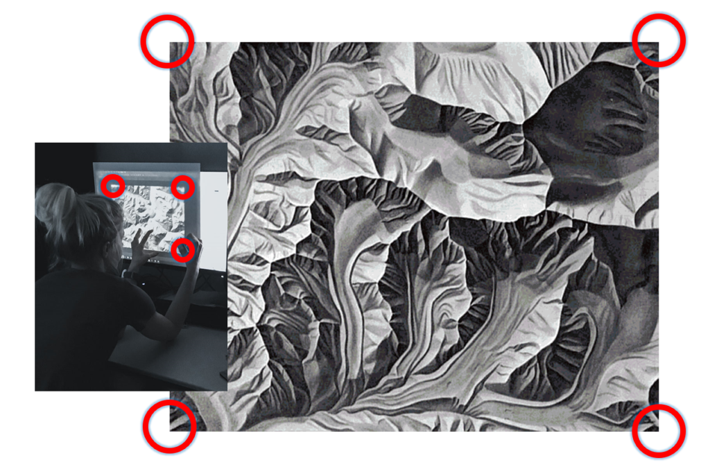
If you began this process by tracing my ridgelines from GIS, you could easily register your paper to be aligned with these now-grouped contours, and simply trace the highest contour line for each group and then color the group in. In this video below, you’ll notice that I used the contours as a visual reference. So as I’m coloring I’m looking at my monitor for where those color ranges from step 3 are. I’m sketching each color group’s highest contour line, and then I’m coloring in that color group’s full area using a medium-to-light pressure.
I like to start with the lower elevations first, and then move upward. This video shows adding the Apple Green and Pale Sage colors to my lowest two elevation range groups.
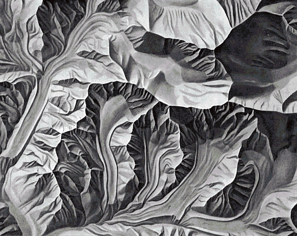
Here is a warm-up sketch after step 4. On the left, you will see just the graphite greyscale shaded relief, and on the right a medium-to-light application of color for each range. It doesn’t look spectacular for two reasons: 1) It isn’t supposed to yet! So don’t be discouraged. You’re doing it right! Step 4 is the point in your drawing where you are getting the pigments onto the paper to manipulate later on. Oh, the other reason it doesn’t look super great… 2) The image on the right is a screenshot of a time-lapse video, which doesn’t make for great photography always.
Step 5 – Blending with COLOR!
This might become your favorite step. Once you’ve colored all your ranges with that medium-light pressure in step 4, you’ll move onto Step 5: Blending! This is where you really get to see the power of soft artist-quality colored pencils. You’ll blend by taking the color of each group and coloring over the next lowest color step with a medium-to-heavy pressure. For example, in this video, you’ll see me color with the Pale Sage Colored pencil over the Apple Green pencil that is used on the lowest areas on this map. By using this heavier pressure with the Pale Sage, these two colors blend together really well. Blending these colors together also softens the boundary into a nice gradient. I’ll continue with this medium-heavy pressure over the whole range of the Pale Sage color group is as well. I might lighten up the pressure a touch as I get to the higher parts of the Pale Sage, so that it is primed for that next-highest color, the Grey Green Light – a great color! Then (not shown in this video) I color with a medium-to-heavy pressure with Grey Green Light over the Pale Sage area, and so-on.
To complete Step 5, you repeat this process for each color in your palette, moving upward in elevation. Note that there is some personal preference for how you do this step, so work until you find the rhythm that works for you and your landscape, but I find this to be a good general framework from which to improvise. (Improvise, please!)
Step 6 – COLOR Modulation
After step 5, you can be done if your drawing meets your desires. Or you could go onto step 6, which is the final step: Color Modulation.
This shading-with-color step isn’t specific to just mapping. Artists shade with color all the time. How you complete step six is really determined by your own creative eye. Cooler colors are great for shadier slopes, and warmer colors work well for brighter slopes. I use a lot of dark green, purple, and lavender for shady sides, and peaches, pale yellows and whites for the sunny sides. Pressure varies, depending on the pigment. The lighter/paler the pencil, the harder the pressure. If you’ll recall, at the beginning of this post there was a tip to lay the darker and more colors first and highlight after you get those darker colors on the paper. You can apply that here as well. Those lighter paler colors will move around the pigments of the bold colors really well – but the bold colors will not work in that same way. So with your bolder colors, make sure you start off with a medium (maybe even medium-light) pressure during your color modulations.
In the video below, you see me adding some of the highest elevation colors as well as the very beginning dark green color modulation to my map. You’ll see me doing a lot of the modulation to the warm-up sketch as well. I may write up an entire post on color modulation at some point soon, but for now, the description above should be sufficient for a solid start on your amazing hand-drawn maps!

The (WIP) Final Map
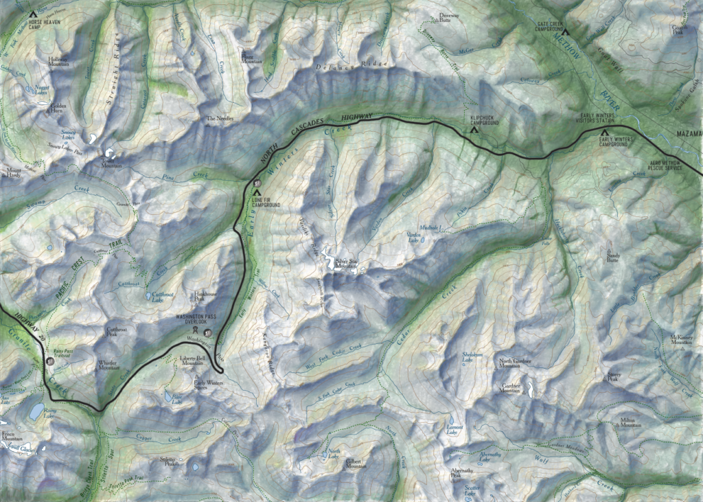
Here is the current version of this color hillshade map along Washington state’s Highway 20, commonly referred to as the North Cascades Highway. This stretch of road is absolutely stunning, and I hope you all get to travel it someday. Just be sure to check the Washington DOT pass report before doing so, because this highway is closed during the winter months!
Please consider this map a work in progress, and not complete. But I wanted (needed) to get this tutorial posted now because I promised about 400 people last week that I would. However, please check back for updates on this map, and perhaps some things I learned while completing it. This current version uses vector data for all map data, except the hillshade, which was done following the steps described in this tutorial.
Remember to enjoy this ultimately meditative connection to a landscape, and have fun with it. Happy mapping – and drawing!