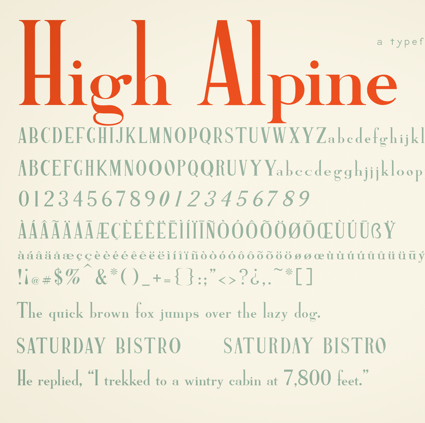
The High Alpine typeface is available now!
High Alpine Semibold has an unapologetically high ascender with no accompanying adjustment to the x-height. The descender was kept rather short as well, allowing uppercase to maintain its towering command. For moments when you designers feel like reaching ultimate heights, I've added many alternative characters; uppercase crossbarred characters have alternatives with daringly high crossbars, and stemmed lowercase characters have longer-stemmed alternatives. Many further glyphs are included with this font to accommodate multiple languages.
The Font is Ready! BellTopo Sans Fonts Design Complete
About the BellTopo Sans Font I designed the BellTopo Sans font, originally inspired by the typefaces on the antique U.S.G.S....
Typography for Topography: BellTopo Sans Typeface & Free Font
While making my own USGS-inspired maps, my search never returned the exact type of font I was looking for. The fruitless search was serendipitous however, because it provided the push to make my own. It was designed for map labels that are no larger than 80-100pt, but usually much smaller. I decided to name it BellTopo Sans with the plan to create a serif version.