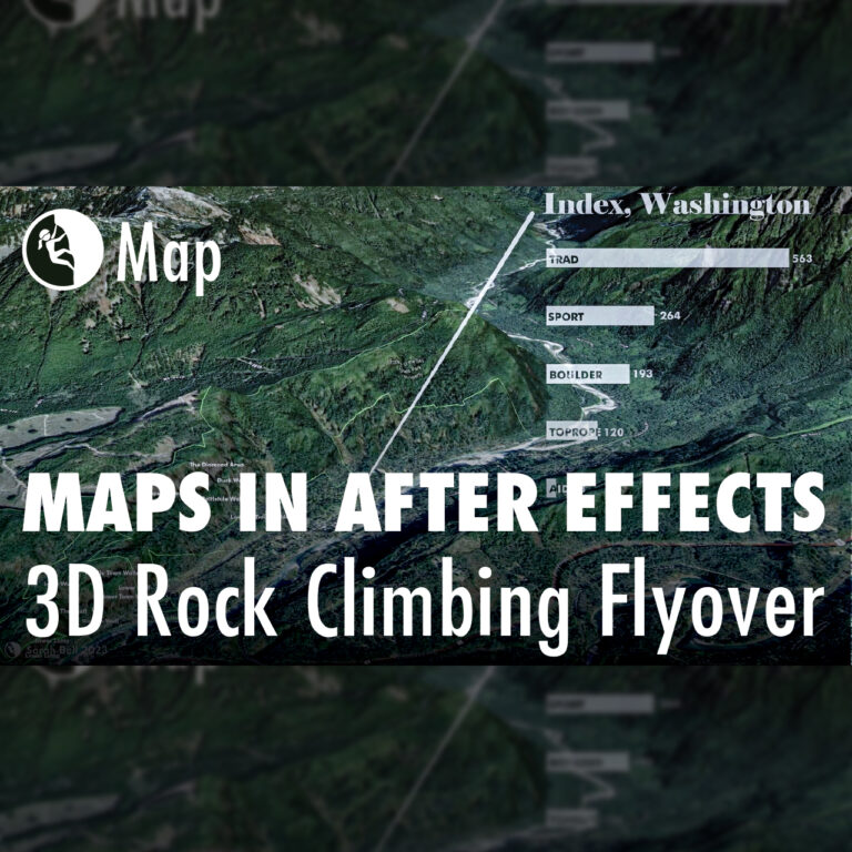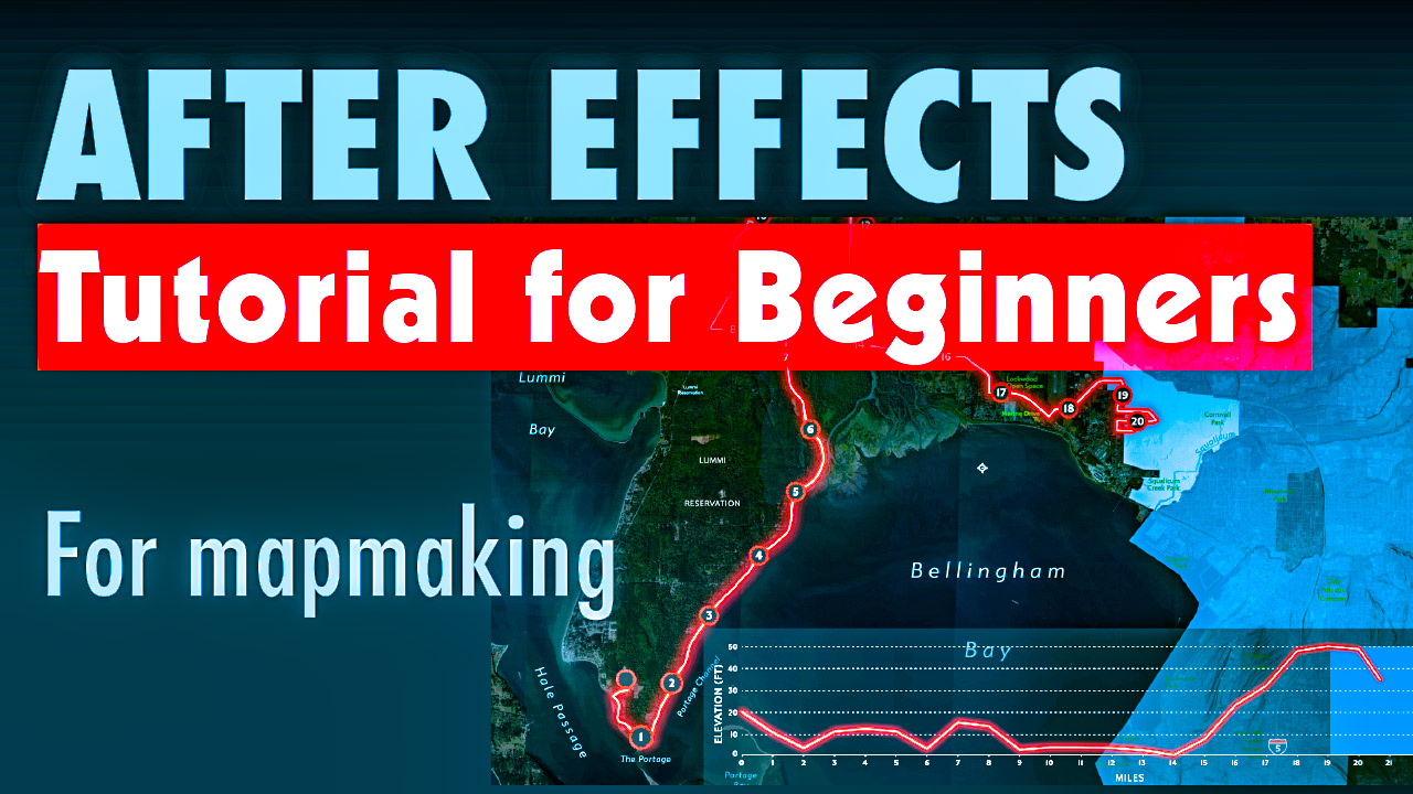
My Favorite Map Animation Workflow & Essential Resources
Discover 7 key tips for diving into After Effects as a mapmaker
Discover 7 key tips for diving into After Effects as a mapmaker
This interactive visualization toggles between two perspectives—changes in voter turnout from 2020 to 2024 and each state’s variance from the national average—transforming static election data into an engaging, dynamic experience.
America has low voter turnout, and the last general election was no exception. Only 64% of voter eligible Americans casted their ballots in 2024. This means that 90 million Americans who were eligible to vote didn’t show up to the polls. This two-page data visualization shows this drop state by state.
Announcing a new Adobe Illustrator tutorial series, beginning with how to make symbols and symbols libraries.
Learn how to hand draw beautiful shaded relief hillshades in this 6-step tutorial.
Building maps often requires multiple software applications. In fact, I cannot recall a map that I’ve made in the last decade that did not include using at least two different applications. For this map, I created a flyover animation in ArcGIS Pro. I then imported the animation (mp4) into Adobe After Effects, where I added…