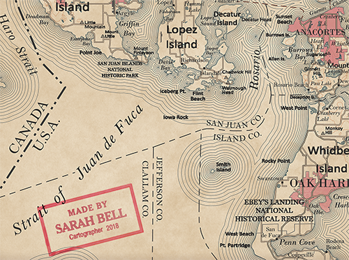
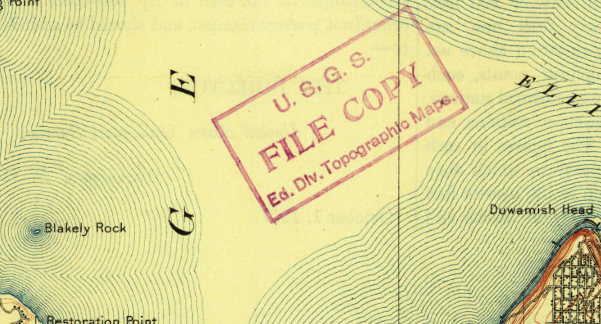
In 2018, I made a few maps that were inspired by the design of the earliest USGS Topos. I had a lot of fun doing it too. I tried to pick areas with large bodies of water, since the concentric shorelines that were popular in maps from the 1800s & early 1900s are super enjoyable to make (my tutorial here!) Much of the time that I spent on these maps was hunting for the right typeface. Specifically, the upright sans serif delicious typeface that was used on much of the physical features like mountains, valleys, beaches, meadows, etc. (Like you, I too see the irony of serif italics for that phrase in previous sentence.)
When you see this typeface that I’m referring to on these old beautiful maps, you may think it is nothing special. It’s simple. It might even be very similar to a common font that you already know. Perhaps you’re thinking, “Why didn’t she use that font?” But for me, the beauty of this typeface that I see on old USGS maps exists within its subtle differences. I included some screenshots at the end of this post highlighting some of the beautiful characters from this typeface in the early USGS maps. I will elaborate more on these characters later. But I am soon leaving for a month of work travel, and I want to release this font into the world before time becomes too sparse.
While making my own USGS-inspired maps, my search never returned the exact type of font I was looking for. The fruitless search was serendipitous however, because it provided the push to make my own. It was designed for map labels that are no larger than 80-100pt, but usually much smaller. I decided to name it BellTopo Sans with the plan to create a serif version. There might be additional tweaks too, so keep looking for those updates! (THERE HAVE BEEN UPDATES. See below).
UPDATE:
As of September 14, 2020, the BellTopo Sans font has new upgrades and improvments, including an End User License Agreement. To continue to use BellTopo Sans, you must agree to the Font Software End User License Agreement (EULA).
You may download BellTopo Sans here and use it for free. Please read the latest for details on the upgrade.
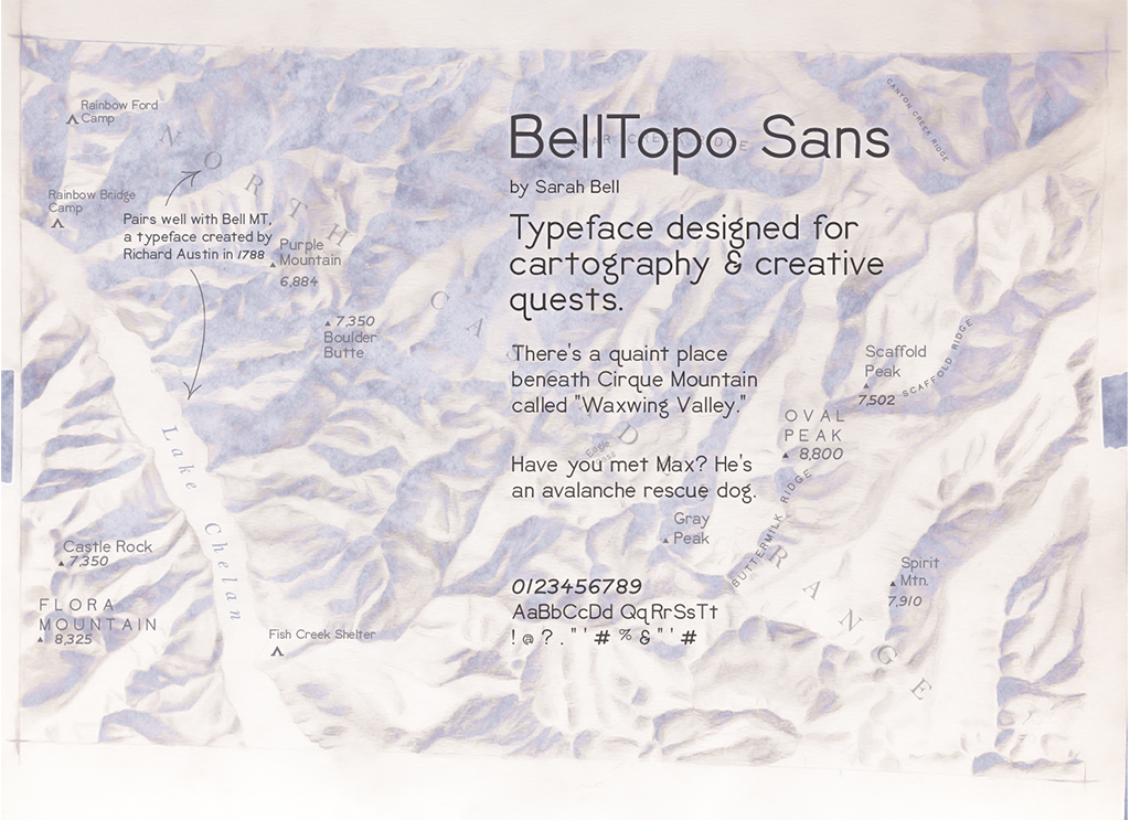
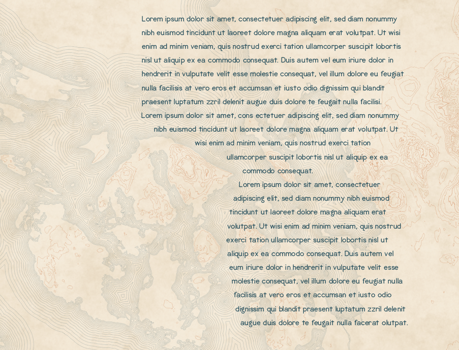
To be quite honest, I’ve never released a font into the world. With all the wonderful type designers out there, it is a bit intimidating! Although I did spend a lot of time on kerning, I am still discovering letter pairs that can be improved. There are also some characters and glyphs that I plan on adding to this font. Nevertheless, after all those hours of kerning, it is rewarding to see a font that you’ve created in paragraph form. While it was designed specifically for map labels for some maps that I’m making, it does pretty well in lorem ipsum.
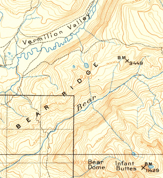
The appearance of “Vermilion Valley,” “Bear Ridge”, “Bear Dome,” and “Infant Buttes” inspired Bell Topo Sans.
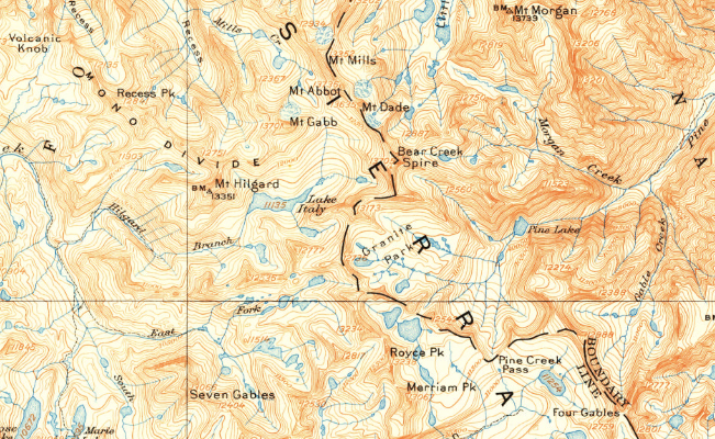
The “g” in “Mt Morgan” and Mt Hilgard, the high cross on the lower-case “t,” and that lovely squishy “S” in “Sierra” are all major draws to this typeface for me.
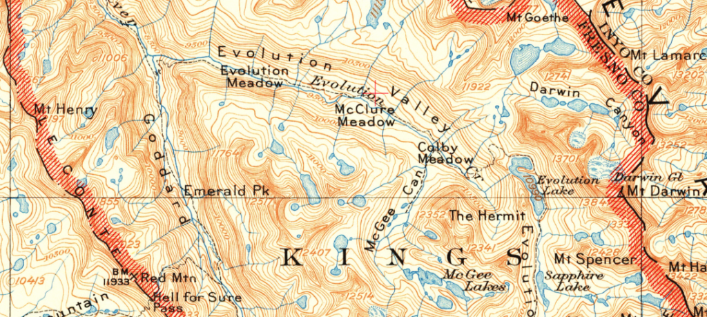
What’s not to love about this image below? Firstly, there is a place in California called “Evolution Valley,” and it is gorgeous. Also, check out that word’s lowercase “y.” and the “k” in “Emerald Pk” is so deliberate yet soft. The uppercase “M” is so fantastic.
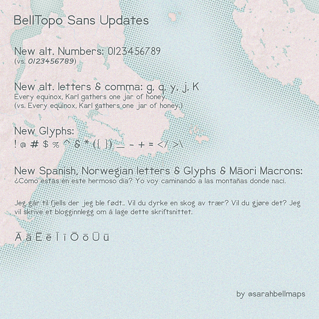
UPDATE! New characters and glyphs added
These updates require that you re-download your copy of this font. You will probably want to delete your old copy too, since they have different file names.
Check back for updates on this font. Happy labeling!
Thanks Sarah for sharing. What a lovely font. Brilliant design.
Nice work! and Thank you.
Gorgeous font, well done, and thanks for letting us use it!
thank you! This is a wonderful font!
Thank you. Continuously evolving, as this is my first public font. It was probably a good choice to start with one that is intended to be charmingly imperfect! I’m still discovering how to best design for purposes beyond display, but I’m a designer at heart.
as a retired USGS geographer, i wonder if Sarah tried to find out who or what group might have developed the face.
Hi, Lee. I sure did! Exhaustively. I spent a lot of time trying to find out who made the typeface, or if it was some sort of standardized hand technique. No information turned out after this search, which was the impetus for making this font. If you find out the person(s) who either made the typeface or did the hand lettering, please let us know. Take care.
The typeface looks quite nice—and I love the historical examples. They remind me of some similar lettering I found on diagrams from the formation of the internet. My best guess at the moment is that they are handmade with a router or (indirectly, mechanically) traced from a template (such as Keuffel & Esser’s Leroy Lettering Set). That might be why there’s so much subtle variation in the letter shapes. See also: https://nationalparktypeface.com/
Such great information, Joseph. It is that hand-made look – the imperfect qualities – that make the USGS lettering so wonderful, imo. I really love that NPS typeface. Thanks for passing it along.
Ever so nice!
Since I live in Scandinavia I would appreciate if the characters Å, å, Ä, ä and Ö, ö could be included in the font.
Hi Micheal. Thank you! I believe we communicated before, but just checking back with you… did you get the updated version with the characters you were looking for?
This is a excellent and wonderful job, thanks
Thank you, Melvin!
Nice Sarah. Experimenting with it on my trail map revisions. As a Kiwi, I’m intrigued as to how you came to reference Māori language in demonstrating use of the macron.
Hi Ken. Great question! It was specifically requested by a user who speaks the language.
Thank you so much for taking the time and effort to devise such a pretty (and practical!) font. And I’m especially grateful for the inclusion of macrons on all vowels (which is important for several languages besides Maori). I’m writing a book version of my dissertation, and this font seems perfect for the several maps that I plan to produce. I will be sure to credit you! Wish you all the best in your future endeavors!
Thanks for your nice comments! There is no need to credit me! I updated the license. I certainly want to make this an open font! Use it in anything you want – no need to credit me. If you created a derivative font software, a nod would be nice – not required. I’m just happy to finally be giving back a font after getting to use so many wonderful fonts by others.
Hi, I’m not a person who’s into maps and mapmaking but I love this work! I think I will be using it in a lot of my presentations and pubmats henceforth.
Cool! I saw a coffee package that used BellTopo Sans and I was surprised at how natural it looked!
Thanks for sharing this font Sarah. I’ve just downloaded it and tried it on a map for the first time and it looks great. Thank you!
Thank you, Helen. I hope to keep improving it. I appreciate your comment!
Hi Sarah- Thank you so much for sharing your beautiful font with us. I just came across your page after you had updated your first version of the font, and I was wondering if there would be any chance of obtaining a copy of the original before the updates? The style of the numbers in the original version are a spot on reproduction of the contour line values on USGS maps, which is exactly what I’m looking for and how I found your page in the first place. Thanks!
Hi Kimberly, Thanks! I like the original numbers better myself as well. Good news! Those original number glyphs are still available in the new font as well. They are the “alternate” numbers in the font. Which program are you using the font in? If it is a design program, there should be a way to access the alternative glyphs for each character as well. BTW, I totally agree with you. The original numbers were directly inspired by the contour labels in older USGS topos. Please get back to me about whether or not you find those characters.
Hi Sarah- Thanks for the reply. Unfortunately, I am unable to find the “alternate” numbers in the font files. I have all four (bold, bolditalic, italic, and regular) installed but the numbers available to me are the updated versions. It is possible that the install process (windows) doesn’t allow the “alternates” to be loaded also. Any chance there is a way for me to separate the “alternate” glyphs out of the file before installing it so I can create a BellTopoAlternate font to access the numbers? Thanks
I started using your typeface on field maps, and it’s more fun to see than the default QGIS font I was using when I’m out collecting data. It sharpens up maps for Wisconsin’s Managed Forest Law program maps I create too. People will be looking at your typeface on plan maps for the next 25 to 50 years. It also looks good on some hobby work I’m doing to digitally mimic symbology and look of early 1900s USGS maps. Thank you!
Well, that is exciting news! I love Wisconsin, and went to UW-Madison in their geography department. Talk about a state that takes mapping seriously! I really enjoy hearing about how people are using it. I just saw a children’s book yesterday that was written in BellTopo Sans. So fun 🙂
Gracias Sara, hermosa fuente!!