Making maps is fun. As a cartographer, I’m biased to feel this way. Still, when I tell people that map-making is my career, a lot of people respond with “I love maps!” so I am not alone in realizing maps’ awesomeness.
At the upcoming Adobe MAX 2019 conference I will be presenting alongside my colleague John Nelson on Map-making for Designers. We will be sharing map design tips with hundreds of creatives from all over the world! Map making requires creativity, and when a bunch of creative people dive into the world of cartography – that is exciting.
For those of you reading this who are regular map-makers, the intro may be a bit of review. There’s a brief discussion about data & attributes to kick off this tutorial.
Data, Attributes, & Datasets
The things we cartographers put on maps is data. So in addition to the aforementioned creativity requisite, map design often requires some data work. Although some folks get excited when they hear “data” others may recoil at the pure boredom that the word might evoke. I’m here to tell you that data can be fun, and this tutorial walks readers through map creation with a few steps for getting started with data using Microsoft Excel.
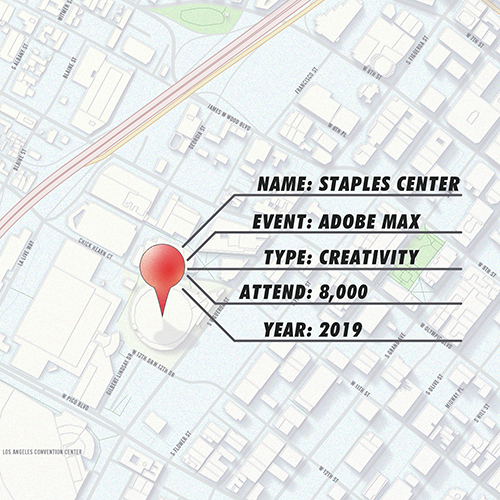
The documents or files that contain data are called datasets, and they can be really small, like the pushpin representing LA’s Staples Center in the image below, and they can also be much bigger than that. My first of two demos at MAX will be sharing some steps for making the map featured at the end of this post. To make this map I used a pretty big dataset. This map features all of the Geographic Names Information System (GNIS) locations in the United States that include the words “Happy” or “Feliz” in their names (A). This post is a summary of my demo for this section of our presentation. This map was created using ArcGIS Maps for Adobe Creative Cloud (Maps for Adobe). Note that the steps featured in this post are focused on map-building steps and not the aesthetic design. The design is up to you!
Map Data Attributes
All map data have at least one attribute: location. This attribute information is what allows software like Maps for Adobe to add it to the map. For example, the image below shows the aforementioned Staples Center in Los Angeles, California, which is the site for this year’s Adobe MAX conference. In addition to location, this red pushpin has a NAME, EVENT, TYPE, ATTEND, and YEAR attribute. (4 qualitative, 1 quantitative, and 1 temporal (time) attribute).
Symbolizing by Attributes
This post will not get into the details of map symbolization. Instead, I’ll use this paragraph to touch upon the higher level point: cartographers use data attributes to give meaning to map data beyond just the feature’s location. Every single designer (map- or otherwise) has their own unique style that evolves and changes with every project. When cartographers talk about symbolization, they are not referring to this individual style of yours. Rather, symbolization is allowing the underlying data to inform some of the design. For example, in the image above, the pushpin could have a label “Staples Center” to help orient readers unfamiliar with the area. Further, if the map had several pushpins on it, they could potentially be sized by the number of attendees – the more the attendees, the bigger the pushpin; this would be a way to symbolize quantitative data. Or these multiple pushpins could be symbolized by the type attribute, by using a different color for the different type of conference; this symbology would be categorical. You could even create an interactive map with that temporal (year) attribute, where users could view the conferences scattered about the country over the past years, decades, etc. Before my current job, I worked as a dataviz researcher on community hazard resilience, and temporal data was extremely important for visualizing hazards like wildfire, floods, and storm events like tornadoes and hurricanes. Even though there is science behind symbolization principles in dataviz, there is still a TON of room for your map to have your own personal style all over it!
The GNIS Attributes
Anyone can go to the USGS’ GNIS site and download the data that I used for this map. Note that the national dataset contains over 2 million locations, so there are a few things to consider if you’re using Excel to manage this data (steps below). Excel can handle 1,048,576 rows from a .TXT file, so if you download all 2 million + locations, you will have to divide the .TXT file into a 2 or 3 files so that Excel opens all the locations. You could instead also download the data at the state level, and make a similar map for your own state. This would make the downloaded file much smaller, and Excel will be able to open any individual state’s GNIS data without problem. I did download the entire national dataset in the .TXT format, so to overcome this limit I did the following:
- Opened the entire national .TXT file in Notepad.
- Divided the data in Notepad into three chunks small enough to be opened in Excel. For example, select all locations that start with A-J, and place them into a single Excel file. Then do the same for K-Q and R-Z.
- Save each new file (GNIS_01.txt, GNIS_02.txt, GNIS_03.txt)
The GNIS dataset has a lot of attributes. The ones I focus on for this map are:
- FEATURE_NAME: The official BGN name of the location
- FEATURE_CLASS: The type of location. This could be one of many things; basin, beach, post office, school, river, etc.
- PRIM_LAT_DEC & PRIM_LONG_DEC fields. This is the official location of the feature in decimal degrees. This field was read by Maps for Adobe in order to place in the correct location.
Whittling down this dataset to just the happy locations
All three of these newly divided text files have more features than I need for my Happy map. To get just the locations from this GNIS dataset that had “happy” or “feliz” in the FEATURE_NAME field, I did the following steps that many Excel users may be familiar with. It requires no additional Excel extensions, so it is a good workflow for those who want to work with what they have. Note that I did the following steps for each of my three text files mentioned above (GNIS_01.txt, GNIS_02.txt, GNIS_03.txt).
Step 1: Selecting Cells with Conditional Formatting in Excel
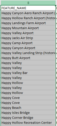
You can format your data in Excel based upon certain criteria. So for my GNIS dataset, I highlighted the entire FEATURE_NAME column simply by clicking on the letter above the column name. In the image below, notice that the letter ‘B’ is green, since it has been clicked, and all the cells in this column are selected.
With all of those cells selected, go to the Home tab, and click Conditional Formatting> Highlight Cells Rules > Text that Contains…

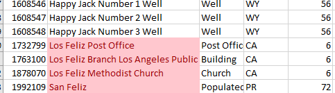
In the dialog, set the following criteria to highlight all the cells with “feliz” in light red with dark red text:

Step 2: Sort by cell color
Now that some of my cells are red because of my conditional formatting, I can use that information to sort my data. Highlight the entire spreadsheet by clicking in the upper left corner of the cells:

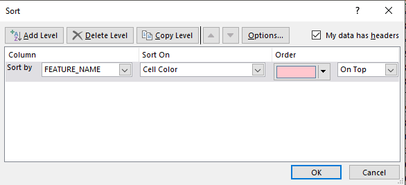
With all the cells selected, go to Sort on the Data tab. When the Sort dialog opens, enter the following criteria, which will put all the red cells at the top of your spreadsheet.
Step 3: Select & copy the highlighted cells
Now that your rows are sorted with the highlighted selections on the top, you can select just the highlighted rows. There are a few ways to do this. Here are two: 1) Click-and-Drag: You can click the first feature row’s number, and holding down the mouse, drag your cursor over all the rows’ numbers that are highlighted. 2) Click-Hold Shift-& Click: Or you could click the first highlighted row’s number, and then scroll to the bottom highlighted row, press the shift key, and then click that bottom highlighted row to select that row and every row in between the first row that you clicked. Then copy the rows: CTRL+C (PC) or ⌘+C (Mac).
Step 4: Paste data into a new spreadsheet
Open a new spreadsheet. With all these rows selected, press CTRL+C (PC) or ⌘+C (Mac) to copy the rows. In the new spreadsheet, click on the top left cell and press CTRL+V (PC) or ⌘+V to paste the data. Make sure you have the header row at the top! Do steps 1-3 for all placenames with “happy” or “feliz” for all the datasets that you might have, placing all the Happy and Feliz locations into the same new file. Save it with a name and location that you will remember.
Open Maps for Adobe & Log In
Go to Window-> Extensions and find ArcGIS Maps for Adobe to open the mapping extension
Sign In
Depending on the type of account you’re using, sign into the mapping extension. For more information on different accounts, check this useful page.
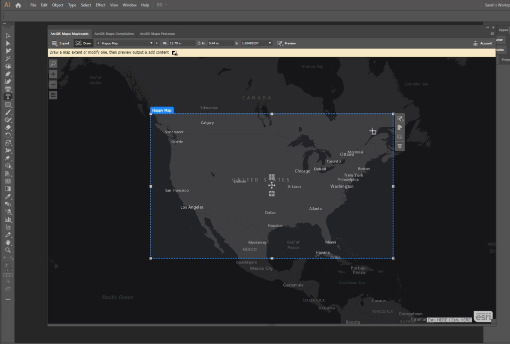
Draw a Mapboard around the area you want to map
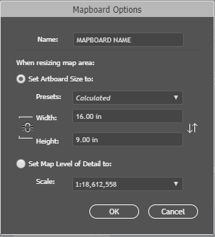
In the mapboard window, click the draw tool at the top of the window. This will allow you to define your map area. You will do this by clicking and dragging your cursor to draw a box; In the image below, I drew this mapboard over the lower 48 United States (see first video below). Note that to get all 50 states for my final map, I reproduced these same steps for Hawaii and Alaska.
When you draw a mapboard, you get the following options dialog. The name you enter will be the name of the Illustrator file that you download. Depending on the area and size of map you are making, you may want to increase or decrease the scale. Weird and fun (and important) fact: Large Scale – closer to the earth (features are larger), and small scale – farther from the earth (features are smaller). Here is a really useful page about deciding which scale to use for your map with this particular mapping tool. When I’m making a map of the lower 48 states, I like something like 1:18 million, and for a state level it really depends on the state’s size, but somewhere between 1:2 million & 1:3 million is a good range to try.
Add the data from your map
In the compilation window, go to the “Add Data” button at the top to open the “Add Data” menu. To add data from your computer, select the bottom option “Add layer from file” like the image below.
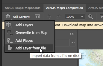
Locate your newly-created .TXT file with all the “happy” locations (or whatever location you have chosen), select it, and click “OK” to add it to your map.

Symbolize the points by their category
You may have noticed a FEATURE_CLASS attribute in your GNIS data. This is the type of feature that it is. In this step, you are symbolizing by feature type, so go to the layer’s menu, by hovering over the ellipse to the right of that layer name, and select “Change Style.” Then select the FEATURE_CLASS attribute from the options by which to style. See these steps in this video below:
Optional: Remove the basemap and add a USA states layer
The default basemap (the map that sits in the backround) is raster data, which means it is an image. There isn’t much that designers can do with this image map in Illustrator. You can remove this map, and instead add a vector data layer, like the USA states. Vector map layers can be edited in Illustrator as artwork, so this is pretty cool for getting your own unique design! The video below shows how to delete the raster basemap. The next video shows how to search for and add the new states layer.
You can remove the raster basemap by clicking on that ellipse menu and selecting “Delete.” Then Go to the “Add Content” layer again. Select the “Maps for Creative Cloud” group from the options, and search for “USA States (Generalized)” to add the states to your map. This data might be a light orange color instead of the blue color in my video below. That is ok! Remember, the styling is all up to you once you download this into Illustrator. You can also do some of the styling in Maps for Adobe before you download by using that “Change Style” ellipse menu for each layer you want to style (mentioned in the previous section).
That’s it for the steps in Maps for Adobe! You can sync/download your map as an Illustrator file by clicking on the Sync button in the compilation window, or keep adding and changing stuff on your map. I repeated all of these steps for Alaska and Hawaii, and then placed them all onto the same Illustrator file for my final map. I also decided to create some mini-maps at the top of my map. You will notice this in my final version; I grouped some of the similar things together, like all the buildings and airports, and all the water features, etc. I put the map with all the features at the bottom of my map in the ‘Everything’ section. I decided to use some inspiration from a childhood’s LED toy, Lite Brite.
Check out this link for some more tutorials for how to get started with this new mapping tool.
The Final Map
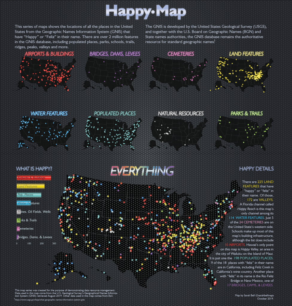
A) Placenames and Mapping
I limited the placename search from the GNIS dataset to English and Spanish, as they are the two most commonly spoken languages in the U.S., and thus the languages represented in the GNIS are largely English and Spanish. But they are certainly not the first and only languages to be spoken here. There are many placenames from native languages that are not represented in the GNIS dataset. In fact, it is likely that a large portion of the points on this Happy map already had – and still have – names that are not listed in this dataset.